
Introduction: Where Function Meets Design
When it comes to exterior design, house number signs are more than just a necessity — they’re a blend of function and style. The right sign doesn’t just help guests, mail carriers, or emergency services find your home easily; it also enhances your property’s overall curb appeal.
Choosing the right font and size for your house number sign may seem like a small detail, but it plays a huge role in both visibility and aesthetics. From clean modern designs to classic styles, every choice reflects something about your home and personality.
Here’s how to select the ideal font and size to ensure your house number sign is easy to read, weather-resistant, and visually appealing.
1. Readability Comes First
No matter how stylish your design, the primary purpose of a house number sign is clarity. The numbers should be readable from a reasonable distance — typically at least 30 to 50 feet away — even in low-light conditions.
Avoid overly decorative fonts that may look artistic but make it hard to distinguish numbers quickly. For example, ornate scripts or vintage cursive fonts can be beautiful, but they often sacrifice legibility for style.
Instead, choose fonts that balance form and function — clean, bold, and easy to recognize at a glance.
2. Best Font Styles for House Numbers
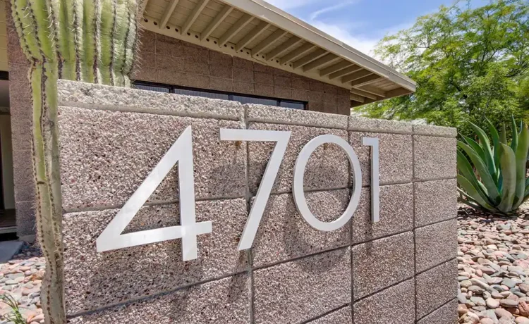
Sans-Serif Fonts: Modern and Minimalist
Sans-serif fonts are the most popular choice for modern homes. Their clean lines and simplicity make them easy to read and visually balanced.
Examples include:
- Helvetica
- Futura
- Arial
- Avenir
- Gotham
These fonts pair perfectly with contemporary architectural styles, offering timeless elegance without distraction.
Serif Fonts: Classic and Elegant
Serif fonts feature small decorative lines at the ends of characters, giving them a more traditional or formal look. They work beautifully for heritage homes or properties with classic façades.
Popular serif options include:
- Times New Roman
- Georgia
- Trajan Pro
These fonts exude sophistication while maintaining readability.
Custom and Specialty Fonts: Personalized Touch
For homeowners who want something truly unique, custom fonts or engraved scripts can add a personal flair. The key is to maintain a balance — ensuring your style choice doesn’t compromise visibility.
3. Choosing the Right Font Size
When it comes to sizing, bigger is almost always better — as long as it fits the scale of your home’s exterior.
General Guidelines for Font Size:
- 30–50 feet viewing distance: Minimum 4-inch-high numbers
- 75–100 feet distance: 6-inch-high numbers
- 150 feet or more: 8-inch-high numbers or larger
If your home sits far from the street or behind landscaping, opt for larger digits to maintain visibility.
It’s also important to consider the mounting height and background contrast. A dark number on a light wall (or vice versa) ensures that the size truly makes an impact.
4. Material and Finish Matter
The best font and size choices can fall flat if the material or finish doesn’t complement your home. For a modern aesthetic, brushed aluminum, stainless steel, or matte black acrylic work beautifully.
For rustic or natural designs, consider reclaimed wood, brass, or copper finishes. Reflective coatings and LED backlighting can enhance nighttime visibility while adding a touch of sophistication.
The goal is to harmonize font, size, and material so that the final design feels cohesive with your home’s architecture.
5. Contrast and Lighting for Maximum Visibility
Contrast is key in ensuring numbers are easy to see regardless of time or weather conditions. Choose colors that clearly stand out against your home’s exterior.
For example, black numbers look sharp on white or light-colored walls, while silver or white numbers pop on dark façades.
Adding soft LED backlighting or solar illumination not only enhances visibility but also elevates the overall design — transforming a simple sign into a glowing statement piece.
6. Balancing Aesthetics and Functionality
While legibility should always come first, your house number sign is also a design opportunity. Whether your home is modern, traditional, or eclectic, the right font and size will complement your architectural features while expressing your unique taste.
Professionally designed signs, like those offered by Orthografica house number signs, combine precision craftsmanship with design expertise. Their custom signage solutions ensure each number is not only visible and durable but also an elegant reflection of your home’s personality.
7. Final Design Tips for Perfect Harmony
- Test before installing: Print or cut a paper template to visualize spacing and readability from the street.
- Maintain proportion: Match the sign’s size to the wall or surface it’s mounted on.
- Think long-term: Choose weather-resistant materials and timeless fonts that won’t feel dated in a few years.
The perfect house number sign achieves harmony between clarity, durability, and design, turning something ordinary into an architectural accent.
Conclusion: Design That Speaks Clearly and Beautifully
The best fonts and sizes for house number signs combine readability with style. Whether you prefer bold, modern typography or traditional lettering, the right combination ensures your home is easy to find while showcasing your taste.
When chosen thoughtfully, your house number sign becomes more than a functional detail — it’s a subtle but powerful expression of your home’s character.


